Showing posts with label roomboards. Show all posts

Saturday, June 19, 2010

Roomboard: Busse Bathroom.

busse2

The Busse’s came to me to help them redesign their guest/kids bathroom, and come up with a “youthful contemporary” look. I decided to use a fresh, modern palette. Not just for the kids, ages 2 and 4, to grow into, but also to appeal to any age since it’s the main bathroom people use at parties. The biggest issue that I know about in the bathroom is the old linoleum floors that are currently in there. I mentioned for them to pick up some inexpensive peel and stick tile from Home Depot to lay on top. I know from my own experience they’ve held up really well the last 3 years with all kinds of splashing, leaking, and tons of traffic with no signs of wear or buckling. And it couldn’t be easier to install!

I started researching the price of vanities, knowing theirs was in the ballpark of 5+ feet, and realized I wasn’t anywhere close in my price guesstimate. I was finding generic white vanities with generic cultured marble tops for almost a thousand dollars! Even Ikea’s most simple design was $550. I think it’s probably best to salvage what they have already and freshen it up with some white paint.

The rest of their house has so much fun, inviting colors (except the master bedroom. what’s up with that, guys?!) that I wanted to add yet another color to their home palette: blue! Since the curtain has so many colors to jump off of, I decided green would be the biggest accent color. I went a little crazy with the main accessories all being from Target since they’re so dang affordable :). This included the funky bright green bath rug, the stripey Hand towel, green bath sheet, and that glorious “Shakira” Shower curtain.

They wanted some storage solutions for the kids bath toys that can be put away for parties. Did I mention how fun this couple is? They love to have people over, but the girls have a whole lotta toys! I chose these Storage bins, also from Target, to hold all their play items. The best part about this is they interlock, and come apart, really easily. The possibilities are endless on how to put them together. As you can see in the picture, one of the bins has the opening facing up, while the others face out. If storage is an issue under the sink because of pipes or other things you have hidden, you can interlock them like a Tetris L (but rotating the L counterclockwise so it lays 3 bins on the bottom) and have only one bin facing out, and the others up to catch toys like a basket. Then just pick it up, and set it in the cabinet. Easy Parcheesy.

I know I use these a lot, but they’re so versatile I just can’t help it! I love, love, love these Anthropologie Knobs, and they come in all the colors of the curtain for you to mix or match. I found the Artwork on Etsy, and thought it would be perfect in an intricate, vintage frame painted white.

So what do you think? Would you enjoy a space like this as a toddler? I think I’d enjoy it right now :)

Friday, June 4, 2010

Roomboard: Just Dreaming.

I found this fantastic tapestry on Urban Outfitters, and thought this would be an awesome alternative to permanent wall paper (and way less hassle to hang!). I dreamed about it being in our dining room since it would go well with the leftover kitchen paint I planned to use in there.

But then I found the most adorable duvet, and my gears started turning. I simply used the side tables and lamp I already had, and the duvet, headboard, and tapestry were all on UO. Simple, but man I want to take a nap in this room RIGHT NOW!
Instead, I'll just keep dreaming ;)

Wednesday, June 2, 2010

Roomboard: Beth’s Nursery.

Before finding out the gender of my sister and brother-in-law's second baby, my SIL, Beth, and I talked about what she would do with her spare room she's turning into a nursery. Without knowing the gender, but having a good idea on the style she likes, I came up with this nursery.


It screams girl right now with the pinks and greens, but it can be easily changed over to a sweet, traditional boys room with some quick switches and even some things staying exactly the same. The pink in the paisley bedding can be switched out with blue. The lanterns and Martha Stewart Pom Poms above the bed can also be switched out from pink to blue. The Anthropologie dresser knobs and the trim around the Pottery Barn lamp can also be switched out. Easy changes, big difference.


However, if you want to take it a step further, you can change out the delicate birdcage for something a little more masculine, like a wooden horse. Or change out the lamp base with a more traditional white spindle base and add a dash of color with a blue or green lampshade.


Since money is tight on a budget, plus already having one kid and trying to move, I tried to give an idea of a very simplistic room that's still high on style. Just throw in your basic white furniture, some bedding in simple colors you can pick up anywhere like Target or Walmart, and stay simple with the accessories in colors that coordinate with the bedding. The window treatment is simple yet elegant, and completely gender neutral. Just hang a bamboo shade on the window and flank it with two sheer curtains on a rod. Since baby needs something to stare at when they're laying in the crib, I've seen this time and time again: lanterns and pom poms. I've seen lanterns at the dollar store, and the pom poms are just tissue paper made pretty.


Easy, right?

Saturday, January 9, 2010

Roomboard: Olive Juice!

You know, the phrase you mouth that looks like “I Love You?” I gave myself a mission. Make a room look a little more 3D, and I mostly accomplished it. However, being the perfectionist I am, I have to say this can’t happen again! I spent many days on this room, but OLIVE how it turned out ;) I wanted a room that needed few decorations and pieces of furniture to test it with. So what better than a nursery? I know there are so many cute pet names for babies in the belly, like peanut and bean, but I thought olive fit, and I hadn’t heard it being used to describe the “bun in the oven.” Then somehow that one little word birthed this baby:

olive2

1. When I thought olive, I immediately remembered this Ikea fabric. And at $7.99 a year, with a couple cuts and stitches to create panels, it will be easy on the wallet and will stick with any design baby has as she grows. I took the tan color from the fabric and created the wall color, and since a nursery should give off a comfortable atmosphere, I wanted a darker ceiling to cozy it up. I love the combination of green and purple, so I chose a dark purple for the ceiling and accessories only made sense to be dark purple and olive green as well! :)

2. For the lighting, I picked not one, but two drum shaped linen shades to keep it feeling contemporary and light. From there, I decided to use tan colored piping and details on the super comfy looking rocker and foot rest.

3. With all the light colors, I wanted to ground the space with espresso colored furniture. However, to keep things contemporary, I wanted storage that was stylish and minimal. I chose a crib with a pull out drawer and the Ikea Malm Dresser, both with nice clean lines and no visible handles. Rather than a changing table, I stuck a changing mat on the dresser so the furniture can grow up with baby! For toy storage, I like the espresso colored wicker with linen lining to compliment the other linen and dark wood elements in the room (and it’s way more stylish than primary colored plastic bins!)

4. For the remainder of the room, I dropped in more green and purple accents. To inject a little personal touch, I put a vinyl graphic of baby’s name and leveled it over a shelf with a vase so it looks more intentional, and a big painting of an olive over the crib. I couldn’t resist throwing in my signature pony obsession with a rocking horse, and softened up the wood floors with a super soft sheepskin rug.

The room feels much more welcoming and cozy because of all the texture spread about. Between the sheepskin rug, chenille throw blanket, linen shades, and wicker basket, all that texture will certainly “feel” like home for mommy, daddy, AND baby!

Monday, December 21, 2009

Roomboard: Under the Boardwalk!

My brother-in-law’s brother's wife (was that easy enough?) asked me to send her the link to the bathroom I made with the fish decal with the mirror bubbles. I decided to do her one better, I made her a room :) She and her husband wanted to do an ocean mural, but thought they may be moving to an apartment. So I tried to find ways to be apartment friendly, but still give them their ocean-like feeling.

melissa
Let me break it, break it down:
1. I actually started the room with the paint color. Normally I save that for whatever strikes me with the overall room, but this color “Sanctuary” by Ralph Lauren not only SOUNDED like it belonged in a nursery, but it looked like it too! You may note it looks a lot like the last nursery I did. What can I say, I think it looks good in baby rooms!
2. From there I picked a bedding that was the colors of the ocean, and boyish without being TOO boyish (The crib color/style just came with the bedding). I decided to put fabric on the wall behind the bed that looked like a sail, making the crib like a ship. Ahoy Matey! I told Melissa I wanted to get a little more creative than just the fish idea, so I turned a kids fishing rod into a mobile with little dangling fish. Then of course, the other wall decoration is my beloved fish idea.
3. For the curtains, I chose these wavy design ones to give the feel of the waves of the ocean, with the color of the sand. Fittingly, I placed this awesome boat shaped bookshelf in front. Design wise in an actual room, there are better places to put a bookshelf, especially close to the rocker for easy access to books when feeding or rocking baby, but theme-wise, it stuck here.
4. I chose this rocker (which could use a matching footrest! I just didn’t want to over crowd the picture) not just because of the clean look, but the colors and overall style reminded me of the upholstery in a designer yacht. Just me? Maybe, but I thought the room needed a touch of luxury for mommy and daddy! I chose a rustic, aged bedside table to go with the look of the old ship.
5. For the lighting, the name of the wall lamps are actually “fishing lights.” They just look like something that belongs on a pier, but much more chic. The table lamp is a basic white lamp that has rope tied around the base. Great DIY project!

I also updated the picture because they wanted a wall mural of an ocean, which sparked the whole theme of the room. But instead of slapping down all that cash for a wall mural, I found this rug at Bed Bath & Beyond for $70 (don’t forget your 20% coupon by signing up for their e-mail list! that makes this rug just $56!)

melissa2

Although most apartment bedrooms come carpeted, there's no reason you can't have a rug to define a space as well! There's always the option to hang wall mural, but this one's just easier to put down, and more mobile for when they take the plunge and buy a house!


Hopefully Baby Busse will drift off to sleep in no time in his new calm, ocean retreat! Although I had hundreds more ideas “swimming” through my mind, I had to stop here before it just got cluttered visually online. Should Melissa choose to use my ideas, I’d be glad to come up with/post more!

Saturday, November 28, 2009

Dining in Style.

You've seen some recent pictures of the dining room from the Turkey Day decorations, and I'm sure you noticed the wood paneling. The dining room was stuck in a major time warp when we bought the house. In fact, the whole house was, and I have proof in the receipts my mom just found of some remodeling that was done in the 70's. I'm not saying anything is wrong with that time, it's just not my favorite. Here is what the room looked like when it was my grandparents:

Little bit of nostalgia for you. The dining room was unchanged my entire life, aside from the carpet. It went from an orange/yellow/brown shag to a nice neutral beige. But it was still the same green trimmed, woodpaneled, pool hall chandeliered room. And it still wouldn't be so bad, except there was an almost identical shade of wood table and chairs in there (not to mention the buffets and cabinets that were in there that were all the same shade).

That was after we took over and cleared out the furniture except the necessities. Now you can see it's a sea of brown. It was cool last Christmas when I found some old linens and made it sort of a cabin, homey feel of Christmas:


...but otherwise, it needed a little toning down. I decided to use my free time when I woke up this morning and find a way to make it a little brighter and more stylish. Problem is, neither one of us want to take down the paneling. We learned from the bathroom remodel that opens up a can of worms, and the last thing we want to do is replace the dry wall again. So we're playng safe, keeping the paneling, and finding a way to make us BOTH happy with it:


It's a little all over the place, but I just tried to combine all my favorite elements into one big picture. Cushy captain chairs, zebra rug, anthropologie knobs, Emeco (knockoffs, I'm cheap!), Damask curtains, and the $39 Diversity Thrift table. I've spent the whole time we lived here throwing together so many different looks for this room, using inspiration, and nothing stuck. I finally started going with my heart and now I found a look I love. It's not easy finding your style!

We're planning on staining all the floors in the house, and I'm really leaning towards a dark stain. But because of that, the walls will need to be lighter or we'll really be swallowed up by all that wood! I initially looked into white washing, but that was pretty insane. So I thought I'd try a light stain instead. And to really help tone down the walls, no matter if we change the wood stain on the paneling or not, would be a gigantic canvas covering most of the upper wall. I took note in a lot of the metropolitan/glamorous spaces I've been lusting over there are big ornate frames covering the walls. And it REALLY brightens the space up. I figured I could just paint a large canvas, and put the miter saw to use some more to frame the picture.


I've also wanted an old decorative wood buffet to hold our dishes so I don't have to use a step stool to get the daily settings. I like the dark wood stained top over the white painted piece, with some pretty little amethyst Anthro knobs. Since a lot of the pieces in this room are diving hard over the line into traditional, the contemporary Ikea light fixture will help keep it in this century, and I'll find ways in the accessories to keep it more modern. Since this is a longterm look, hopefully the next place this set resides in will have normal walls surrounding it to make it easier to decorate!

Friday, November 20, 2009

Roomboard: How Alluring.

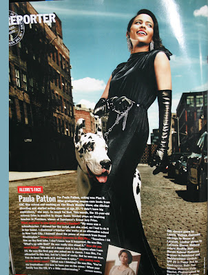
I was flipping through the stack of magazines my mom passes on to me when she's finished, and thought I'd study up on the latest trends in clothing... to avoid. But this picture from the November issue of Allure caught my eye, and the colors and architecture were love at first sight.


I sat and studied every detail in this picture, because it was all pure perfection to me. And trust me when I say this, that never happens. I guess I was just in an observant mood! The more I looked at it, the more I thought how awesome each detail would look as pieces in a room. Would you expect anything less from me?


Though this doesn't really NEED explanation, so I'll try to keep it short!

The fireplace reminded me of the texture and stone of the road. The painting's designs and colors are pulled from all the colors in the picture, and made me think of the bricks and windows of the buildings. The white vases on the fireplace are shaped like the clouds in the sky, and I used the texture of the clouds to pick out the shag rug. The slipper chair fabric is identical to the red building above the puppy's head. The coffee and side tables were inspired by the buildings colors, windows+window trim, and even the ladders on the buildings. The cowhide pillows were as close as I could get to the pretty coat on the puppy. The wall sconces are so cliche being inspired by her earrings, but hey, it works. Keeping with the outfit inspirations, those hot black leather gloves she's wearing translated to the sleek Ikea sofa. The table lamps look exactly like where the sidewalk meets the brick road, and the big elephant in the room: wall color from the sky! I chose Harbor by Behr. I picked it by eyeballing swatches online with the magazine spread, and was shocked to find it was almost dead on to the picture once I uploaded it!

I almost wish I had another room to design to make this happen. Oh, please, someone want this so I can do eeeet!

Thursday, November 12, 2009

Roomboard: Melinda's Main Squeeze.

Although this was my second room to makeover from pictures of an already existing space, it was my first big challenge since the last one was a bathroom with the (permanent) bones already there. This bedroom belongs to Melinda. I made her the Wizard of Oz room a couple weeks ago for fun. However, she wants to keep the wall color and the main furniture, but make it look more grown up.


Like most women, she’s a big fan of Target. Who isn’t? Their stuff is stylish AND affordable. So I decided to use only Target purchases in this room as part of my challenge. And a challenge it was. I had to break down and cheat in the end by using fabric from another website for the curtain and the cushion on the end of the bed, but that’s it! Surprisingly, Target doesn’t have such a wide array of curtain patterns in black and white as I hoped. Now let’s break it down!


1. Melinda already had 2 black bookshelves that looked like they got a lot of use, so I wanted to incorporate them in a way that they’d be even more functional. I stuck them behind the chair so she can have her books within reach while she’s lounging around, and she can used these frosted storage bins to hold all her odds and ends. To make it less of a library, I put some chic contemporary accessories on the top shelf. She already had a white bedside table, so I took it from her bedside and used it as a side table for the chair. Suddenly the dark bookshelves aren’t dark at all!

2. She has a dresser that she has painted many times, but what’s one more coat for good measure? I chose a charcoal color (try Ralph Lauren's Urban Loft line in Bleeker) so it’s a little darker than the knobs so they still stand out, but not quite as dark as the bookshelves since it’s a large piece that will be standing alone. She already has those super modern pulls, so the only investment in this piece is more of that paint! I pulled some design cues from a dining room buffet by flanking the drawers with two lamps, a centerpiece of lemons in a circular bowl and a crisp black and white portrait behind it.

3. The chest in front of the bed was also an existing furniture piece that was up against a wall. I moved it in front of the bed and chose the charcoal color again for this piece to tie in the dresser since they’re two different styles. I picked a very thick, white textured fabric cushion to go on top so Melinda has a place to put on and take off her shoes.

4. The only furniture I added in were a headboard and the side tables. The headboard is an easy DIY, but this headboard came with the picture. Since Melinda’s room is upstairs with sloping walls, I wanted to bring in lots of reflective surfaces, so I chose these mirrored side tables. They not only add sparkle and light, but lots of glam as well!

5. Now onto all those wonderful fabrics! I chose a clean, modern circle pattern bedding since it wasn’t busy, but still had some pizzazz. I chose two charcoal pillows with a damask pattern (for $15!!) to pull in the side chair design and the color of the chest and dresser, and a yellow/white tie die effect pillow to go front and center to pull in the wall color and add a touch of personality. The window sheers are a burnout pattern to pull out the design in the punchy yellow pillow, and the center panel is fabric I pulled online from Timeless Treasures. I also found the fabric pattern on that side chair online, so it can be bought and used to recover her existing papasan chair, if she chooses to keep it. Although it’s a lot of different patterns, using only 4 colors to tie them altogether helps keep the look cohesive.

6. Next up, those accessories! As you can tell, I pulled in my usual circles and squares. It’s easy to design a room just mixing and matching those two shapes. As I mentioned earlier, I wanted lots of reflective accessories and surfaces to make the room feel larger. So I chose that super chic sunburst mirror to shed some light on the dark colored shelves, which has little capiz shell details. I love those ball lamps, but instead of the usual acrylic balls, I went with chrome to inject some industrial chic in this space along with the bowl on top of the dresser. I picked this bowl because it has the same look of the bedspread, and filled it with lemons to pull in that punchy yellow pillow from the pillow and curtain panel. I also used one more bright yellow detail with that daisy flower dish on the chair side table. This can be used to hold Melinda’s rings, earrings and any other little trinkets. I put in some pale pink flowers in a black and white vase to match up with the candle holder on top of the bookshelves, and add a personal touch with her initial on it. The frame around the large picture is actually bronze, which is pulled from the pharmacy lamp beside the bed, and picks up the tones in the wood vase that is on the book shelves. I went along with my trusty black framed, white matted black and white portraits over the bed since it’s a classic look that works in any space. I chose black lampshades to detain the ambience to a close proximity, and I only used table lamps make the room feel more cozy and elegant. No harsh lights in this peaceful getaway!

A lot of things in this room can be DIY’d, from the lampshades to the curtains. Here’s some tips:

Curtains are so easy to make. Just measure from top to bottom how long you want the panels, then add 4 inches to the top and 2 inches to the bottom for seam allowances. As for the width, measure the width of your window, and that will be how wide you want ONE panel to be. Don't forget to add another 4 inches to your width measurement for seam allowances. I just used a store bought panel as an example when sewing the pocket for the rod, and it was piece of cake.

In this picture, the headboard came with the bedspread picture I found online. But you can just cover painting canvases with fabric and hang them in a grid, or if you’re really handy you can nail three 2x2 pieces of wood together in the width of your bed and as tall as you want, and nail batting and a solid fabric to it.

The chest cushion for the end of the bed is an easy DIY project as well. Cut some foam to the size of the chest, then sew on some fabric. Next, tack on some straps to tie around the top door of the chest. That way every time you open it, the cushion stays put. Of course, you need a little sewing know how, but if you can find something in your house that’s similar, just study how it’s made and jump in and try it!

Monday, November 9, 2009

Roomboard: Meaghans Modern Whimsy Nursery.

I designed this whole room off my favorite crib bedding, by DwellStudio no less (who made my comforter!). All I told Meaghan was that it would be Modern Whimsy. I can get strictly modern when it comes to making someone else's space. However, for a nursery I wanted some cute woodland creatures tossed about for a little whimsical feel. I tried to inject some touches of soothing luxury to keep mommy and daddy happy and relaxed in this space as well. After all, isn't that what a nursery is all about? This is what I came up with:


1. As usual, I went with the espresso wood furnishings, and wanted to keep them less bulky looking with the frosted glass dresser, open legged Poang chairs, and the raised leg side table. I didn't put in a changing table because I feel like it's pointless to invest in a piece that will only be useful for a couple years, for you to just sell off for a dresser. I put a foam changing pad on top of this dresser and ta-da, you're years ahead of yourself! The side table opens like a cabinet door so you can stick your baby books inside for easy reach and they can sit neatly upright for easy pickings. I put up a white shelf to keep the walls light and to hold the baby monitor and some cute family pictures and little trinkets.

2. As I mentioned earlier, I'm in love with this bedding. Meaghan said she liked patterns, so I pulled some colors from the Owl set and picked out some contemporary pillows to toss in the crib. The crib skirt is striped fabric that you can cut and literally just hang from underneath, or pin to the mattress. I chose a soothing sage green solid sheet to compliment the owl print, and I would love to pamper baby in super soft high thread count. Nothing but the best for baby! And hopefully, it would help with a rare good nights sleep. Hey, you can dream ;)

3. I'm a texture person, so I picked floor length, super silky curtains, and a large, soft sheepskin rug that both you and baby won't want to step off of. The floor lamp is covered with paper with a spiraly wire frame to give it some form, and it provides a nice soft ambience (and only $15!!). The table lamp is capiz shells. This is very contemporary, and pretty trendy, but you can't get much more texture than this!

4. Now for the best part of this baby paradise, the whimsical details! These deer wall decals are SO cute, and don't overpower the room since they're plain white. I wanted something behind the crib to add some personality to the blank space, but I didn't want anything unsafe for baby. Enter the tree decal! Since there were so many fun trees in the owl bedding, I decided to play them up just a little more. You can find thousands with a quick "tree wall vinyl" google search. Also, I can't begin to explain how excited I was to see this new Poang chair cushion at my Ikea trip in Philly. Oh how I wish it was out just a few months ago when we got our Poang chairs! As much as I wanted more trees in here, I decided to stop them there and just use a green cushion in the foot rest. If you're looking for more of a rocking chair to put baby to sleep, they actually make a rocker version of this chair now. Score for Ikea again!

5. From the foot cushion, I decided to put a little more green in the room with the Bumbo. I never heard of this until I met my neices, and fell in love with this adorable "babysitter." I threw in a simple wood toy dangler from Ikea as the only toy. Although I didn't include it in this picture, there are endless options for toy storage. I like this open bin clear storage to help your growing child keep their toys organized. I love clear storage bins to keep my space neat but still somewhat visible, and I REALLY love labels. Also, having this large storage system with so many different compartments for different types of toys, it should be fairly easy to use the toy in/toy out rule when it comes to accumulation of toys. Just try not to collect past capacity of this piece of furniture when it comes to toys, and when a toy comes, in, a toy goes out to make room. I know it's hard with the grandparents spoiling the little booger, but it's worth a try!

6. Lastly, or maybe it should have been firstly, I picked a very subdued, soothing shade of greenish blue called Vermeer by Ralph Lauren. I'm a big fan of their paints because the most used room in our house is the only one with Ralph Lauren paint, and it's also the only one that hasn't needed a touch up from scuffs or wear and tear like all our Behr and Valspar paints. Sounds like a winner for descrtucto baby's room!

I look forward to the day I can design in person, especially in a fun kids space!

Roomboard: Adrian and Alastair's Guest Bathroom

I sent out a request (ok, I begged and pleaded!) for someone to turn over a room that needed help so I could fill my spare time I’ve suddenly been handed while Drew studies for a big exam. I was so excited to get a response from Adrian, because I’m just crazy over bathrooms. I went house hunting after putting this hot little number together, and realized how many homes have such blah bathrooms that the typical human being spends AT LEAST an hour in every day. Ok, maybe more of the female persuasion does, but you get the idea. I look at my bathroom and I can’t imagine having white walls and all white fixtures. If I had my way, I would spruce up EVERY bathroom with lots of color and style. I’ve been through enough theme-y kids bathrooms to know what works, what doesn’t, for both guests and home occupants alike. So I tried to display that in this space. This can be tweaked and worked over to work for anyone, but the basic principle is modern, clean lines to inject some style and personality, earthy tones and materials, but add in a couple fun elements spruced up to a more adult like style without being too theme-y. Lets get started! Here's the before:
And here's my design plan:


1. The paint color is Versatile Gray by Sherwin Williams. It shows much different under lighting (so versatile!), but it’s a nice neutral to work with and help brighten up the slate tile and espresso wood furniture.

2. Nothing screams masculine to me more than slate flooring. This slate mixture is where I pulled all my colors for the room and set the tone for the whole industrial, masculine feel. Once grouted, the slate will play up the textiles beautifully. I don’t have a crystal ball to tell you if slate will be “outdated” according to the masses, but it’s a natural stone, so to me it would never go out of style. I chose to use 12x12 tiles on the floor and the shower stall to keep the eye moving around the room. Putting in the same size from the floor up the walls won’t break up a space like different sizes would, which is important in a fairly small bathroom. I did add a border to give the tile some interest. Although many borders can really date a space, or your taste may just change (like wine grapes in a kitchen, or turquoise border around hot pink tile in a bathroom!) using the same tile in a different size or shape won’t look as outdated, or out of place like a special personal touch would. I also kept it near the top of the shower stall so it won’t shorten the room like it would at a lower height.

3. Since this bathroom was described as Alastair’s bathroom, but was still the main guest bath, I wanted to bump up the style but still keep it playful enough for a little boy. Growing up, my little brother had an underwater theme, like most kids do in a bathroom. It was very theme-y, which is cute for a kid, but as my brother ages (and myself being 18 and getting ready in there) it didn’t work forever. So this cute little tropical fish wall decal swam in, and the bubbles he’s blowing are small, round mirrors. I liked where Adrian had his circle mirror before because even in the pictures, it appeared to keep the space open and light. So I just threw in several more in smaller sizes, and took them up the wall to add more height to the room.

4. I’m big on complementary colors, but I like to shake things up using different shades of complimentary colors to add some interest. So in this room I put in earthy light blue slate, navy blue textiles that were on hand, and for the accessories I added in bright bold orange to heat things up. I literally squealed when I saw this Jonathan Adler hot orange wastebasket, ON SALE. Trust me, Jonathan’s pieces are not cheap, but this price was actually in line with something you would find at a department store. I’m a huge fan of his happy, colorful pieces that are oozing with personality. I simply couldn’t resist.

5. Since it is, after all, a kids bathroom, a kid needs some storage for his toys! Since the toys are so colorful, I picked out very subdued storage baskets to sit on the floor, since they blend well with the slate flooring. I added some texture using these natural Abaca tree bark baskets, and because they’re lined with cotton fabric, they’ll dry faster than sitting in plastic bins and can be washed to keep out the mildew.

6. I’m a big fan of crisp white towels. They look clean, luxurious and can brighten up any dark space. I highly recommend spending the big bucks to get quality Pima Cotton towels. They will stay soft through countless washes (which should happen often with towels!) and who doesn’t want to feel like a million bucks being wrapped in luxury every day? I added in some navy blue hand towels by the sink to tie into the existing navy blue textiles and inject as much color as possible on the neutral backdrop. Don’t forget to fork over those precious pennies for the hand towels too! You and your guests will thank you for many years to come. Nothing like pampering loved ones!

7. I wanted a modern vanity with frosted glass to keep it airy, enough counter space for the little one’s products, and a bright white sink to tie it in with the toilet and tub. I found this little beauty and it fit the bill for everything on my list. The cabinet space is large enough to house all of Alastair’s extra products, and guest necessities like soap, lotion, towels and TP. It’s a dark granite counter, but the white sink helps break up the darkness. Granite is very overplayed, but it is, after all, a natural element, which I wanted to be main stage in this room. They make spas with these products and shades for a reason! The mirror is much like Adrian’s current one, but with a wood bottom and shelf. I chose this one mainly because the shape of the wood at the bottom “mirrors” (ha!) half the counter shape below that’s lining the sink. I’m obsessed with the details!

8. The lighting that was not all that pretty. I went with this one to keep all the light that’s in there currently, but broke it up so it's not as harsh or overbearing by having 4 different lights and shine it down on the occupant, while light still seeps through the shade. There are lots of chrome fixtures in the room, so I picked a fixture with large amount of chrome on the lighting. I like shiny surfaces to give lots of depth, and the reflective surface opens a space up. I noticed in the pictures Adrian sent me, his TP was squished in between the vanity and the toilet, and the toilet brush was stuck in the back of the stall. To inject just a little more style, I found this multi-functional little number: a TP dispenser/brush caddy in one! As a personal preference, I like the TP in front of you so you don’t have to turn at all to reach it, and to be honest, having it on one side may not be conducive to someone who prefers it on the other. Having it front and center, it’s wham, bam, thank you ma’am. No preferences disregarded, and a happy, speedy, guest bathroom go-er. Having the brush on there, although not the cleanest thing to have in the facilities, is at least keeping the floor clear of clutter. Plus, that space wasn't being utilized before, so now it's no longer a plain, open wall.

9. When I saw this sleek, espresso colored bathroom storage piece, that looks just like an upside down version of the vanity, I couldn’t help but paste it up in this room. The light paint and all the chrome fixtures will definitely help tone it down if you're worried about having heavy, dark wood all across one wall.

10. And lastly, the littlest detail I made sure to not overlook: the stainless steel switch plates. It was one thing Adrian said he wanted to change out but just hadn’t yet. It’s so inexpensive and easy to change out, so I made sure to include it. However, one thing I would do, from experience of course, is change over to the huge contemporary switches so the stainless doesn’t get all smudgy for one, and two, the little hands can flip the switch easier. And even as a big “little one,” I enjoy playing with those switches. I’m just sayin’.

Sunday, November 1, 2009

Roomboard: I can see your Halo.

The Xbox room. Inspired by lazy xbox obsessed friends and the Xbox 360 system itself:


  1. The green table lamp is inspired by the green light ring on the console, and the red mirrors above the bed are from the 3 rings of death.
  2. The round pillows on the bed should be obvious: the controller buttons. The white comforter comes from the overall white on the controller, and the gray throw comes from the bottom color on the controller.
  3. The rug is pulled from the logo on the packaging box.
  4. The fan and accessories were inspired by futuristic games, and although you can barely see it, the candle holder on the bedside table looks like a stack of xbox games:
  5. The wall decal is a 4' tall Master Chief.
  6. The base of the side table next to the game chair reminded me of the curves of the controller, the top of the table reminds me of the analog controls, and I provided some GAME FUEL Mountain Dew and power bars for the intense gamer.
  7. And lastly, for said intense gamer, a pile of clothes from days of being glued to the 52" tv several days in a row.
Hopefully SOME guy SOMEWHERE would enjoy hanging out in here. I've convinced myself I'm not as good at designing a mans space as well as a females. I thought it would be the opposite!

Thursday, October 29, 2009

Roomboard: Follow The Yellow Brick Road.

I'm getting cheesy with titles, but I've never been good at them to begin with. Last night I was talking to another friend who wanted to redo her bedroom. She just wanted something sophisticated, but this woman has loved the Wizard of Oz as long as I've known her. So of course I had to use that as my next inspiration!

I just love this room. It's way more sophisticated than I thought Wizard of Oz could be, and actually, more than I could have ever planned out for my own space. Let's break it down!

  1. The Target wicker frames are based off of Dorothy's basket.
  2. The Walmart bedspread was a more grown up interpretation of her dress.
  3. The Target capiz chandelier table lamp comes from the sparkles in the wand. I didn't realize it until after I showed it to my friend that even the pole on the lamp matches the stem on her wand! Sometimes I even surprise myself ;)
  4. The roses "stemmed" from her shoes (that was an easy one!) and the gold square vase, the yellow brick road! I thought to put those two inspirations together since her shoes are what's connected to the yellow brick road in the movie! See now how they're even on top of each other? You can find roses, real and fake, anywhere, along with a simple block vase, so I just pulled it off Google Shopping.
  5. The bedside table I pulled from both her hair and Toto. I'm big on dark furniture because it's very modern, and mixes well with traditional pieces without sticking out as two completely different styles. I also pulled this piece from Google Shopping, but it can be easily replicated at Target.
  6. The Ikea sheepskin rug and the Urban Outfitter's headboard weren't necessarily pulled from the inspirational photos, but I wanted to make the pieces I did pull feel more luxurious and grown up. If I could put them with any of the photos, I would call her shirt, since the bedspread is her dress. But that's really going out on a limb to try and make excuses on how I came up with those two!
  7. The paint color is light and airy, and picked out from a picture of about 30 paint chips online. I have no idea what color it is, but I wish I knew now. It's nothing like my taste in colors, but it's a great color for a peaceful retreat.

My friend is on a budget, as we all should be, so I wanted to pick affordable options to update her space. Grand total for this room is about $500 with the options I chose. The headboard alone is $300, but I plan to try and whip up my own version soon. Hopefully for much less, since we're purchasing the power tools this week!

Wednesday, October 28, 2009

Roomboard: Still Seeing Green.

I received quite a bit of positive feedback on the bathroom, so I made a master bedroom to go along with the bathroom. I'm not one to make rooms flow together so intentionally, but I created a much more subdued version of the bathroom to make it feel like a relaxing master, but still had a lot of flow with the bathroom. Bonus points if they actually connect! Here's the inspiration board for the bathroom again:


Using this photo as my inspiration this time:

Here is the master bedroom, this time full on photoshop model:
All of the accessories, bedspread, wall graphic and lamps can be purchased at Target. Everything else was Google Shopping searched, but can be mimiced with more Target furniture. The mirror vanity is a huge splurge, as are the Louis Ghost chair in black and that Kelly Green headboard no matter where you find it, but so worth it, right?

Roomboard: In the Navy!

I was talking with one of my coworkers about my upcoming navy blue/mustard craft room, and she mentioned her daughter wanted to have Navy Blue bridesmaid dresses in her wedding with pink accents. I had actually used someone's navy blue wedding as inspiration for my room, so I thought why not mock up a wedding to match the room?


Now to break down the mood board:
  1. Invitation. I went with a very vintage look for this pretend wedding, and the bird and scrolls drew me in. It has almost a tattoo look to it, but it had the perfect colors to match the wedding. It will also help tie together some key details down the road.
  2. Navy blue silk bridesmaids dresses of course!
  3. Wedding Dress. I love the look of the shrug with the old 40's style hat and netting. The short cut of the dress would work best in an outdoor/casual wedding. The shrug would work nicely with a simple floor length wedding gown as well for a more formal event.
  4. The cake. I used vintage, dot patterned milk glass as inspiration. The navy blue ribbon on the cake would tie together the flower girl and ringbearer details below, and of course match the overall navy blue theme. The flowers are similar in color to the bouquets, but a different flower that would work better as a cake topper, pink and yellow roses. The metal pan it's sitting on was actually silver. I edited the color to an aged brass shade to make it more antique. The scroll on the pan pulls from the invitation.
  5. Plastic cups can look elegant next to a pretty aged brass vase with delicate pink and yellow roses on a navy blue table cloth. Frame some pictures of the bride and groom and family and friends in gold frames around this set up.
  6. Groom and Groomsmen. Navy blue suits, soft, silk ties, and orangey/yellow/pink calla lillies to match the bouquets.
  7. Bouquets. Orangey/yellow/pink/ivory calla lillies, tied with navy blue ribbon and gold charms hanging from the bows.
  8. Card holder. Bird cage! See where the bird in the invitation came from now? Both screamed vintage to me, but tie themselves together. Pretty pink ribbon on top pulls from the men's ties.
  9. Table setting. Navy blue table linens, white chairs (pretty standard at most halls) and pink and yellow flowers trailing down the middle. White ceramic accessories pop against all the colors.
  10. Ring Bearer Pillow. White satin to match the bride and flower girl dresses, with a navy blue ribbon tied across it. Hang gold rings from the ribbons.
  11. Flower Girl Dress. White satin with a navy blue sash. Pink/yellow/ivory roses to tie into the drink table decoration and cake topper. For their basket, a birds nest or white bird cage would be adorable to drop petals from.

There you have it. A picture perfect vintage inspired wedding with navy blue, pink and yellow accents! Makes you want to walk down the aisle again, right? I sure do!

Roomboard: Green with Envy.

I decided to take a stab at planning an entire room around nothing but one photograph as inspiration. Surprisingly, it was easier than I thought. So P.S., if you have a favorite photograph of a room or person, send it over for me to dissect!

I used this photo as inspiration:

Which became this:

Now I'll break down how I went from a swanky hotel to... a bathroom.

  1. The paint choices. Black, White, Kelly Green, and Black and White prints. In this room, paint the walls Kelly Green, the vanity black and the mirror frame white.
  2. The shape of the mirror pulls from the trim around those shelves that hold the bottles in the back wall.
  3. The design of the shower curtain and vanity lights pull from the chandelier.
  4. The light wood choice pulls from the liquor in the bottles.
  5. The line of ceramic accessories that would go on the light wood shelves comes from the row of white chairs at the bar.
  6. The vanity of course comes from those FABULOUS chairs in the foreground that have a white top trim and are a mostly dark color.
  7. The smaller chairs in front of the huge ones even looked like toilets, so that's what spun off into the idea for a bathroom in the first place.
  8. Glass drawer knobs mimic all the shiny glass surfaces in the picture.

All the accessories like soap dispensers, tissue holders or whatever cutesy stuff you might want could be any black and white print (houndstooth, damask, checkerboard.. they would all go with the simple shower curtain, which was the reason I picked it) or more bamboo. However, the bamboo would pop more on the vanity and give it a more earthy feel. Your choice which you would prefer depending on taste. Everything I put in my board came from Target, Home Depot, and a Google Shopping search. For all the accessories and paint combined, it came to a grand total of $375.

There you have it. It was so much fun to pick apart and give a new spin on an already fabulous room. There will definitely be more in the future. So bring on more inspirational photos!