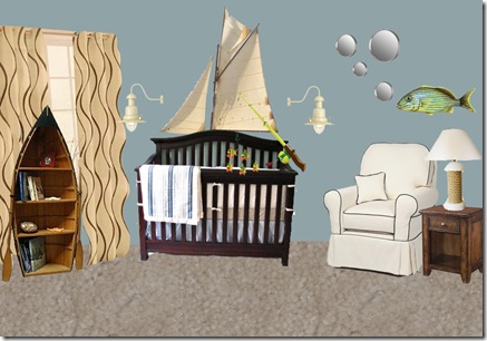
My brother-in-law’s brother's wife (was that easy enough?) asked me to send her the link to the bathroom I made with the fish decal with the mirror bubbles. I decided to do her one better, I made her a room :) She and her husband wanted to do an ocean mural, but thought they may be moving to an apartment. So I tried to find ways to be apartment friendly, but still give them their ocean-like feeling.
Let me break it, break it down:
1. I actually started the room with the paint color. Normally I save that for whatever strikes me with the overall room, but this color “Sanctuary” by Ralph Lauren not only SOUNDED like it belonged in a nursery, but it looked like it too! You may note it looks a lot like the last nursery I did. What can I say, I think it looks good in baby rooms!
2. From there I picked a bedding that was the colors of the ocean, and boyish without being TOO boyish (The crib color/style just came with the bedding). I decided to put fabric on the wall behind the bed that looked like a sail, making the crib like a ship. Ahoy Matey! I told Melissa I wanted to get a little more creative than just the fish idea, so I turned a kids fishing rod into a mobile with little dangling fish. Then of course, the other wall decoration is my beloved fish idea.
3. For the curtains, I chose these wavy design ones to give the feel of the waves of the ocean, with the color of the sand. Fittingly, I placed this awesome boat shaped bookshelf in front. Design wise in an actual room, there are better places to put a bookshelf, especially close to the rocker for easy access to books when feeding or rocking baby, but theme-wise, it stuck here.
4. I chose this rocker (which could use a matching footrest! I just didn’t want to over crowd the picture) not just because of the clean look, but the colors and overall style reminded me of the upholstery in a designer yacht. Just me? Maybe, but I thought the room needed a touch of luxury for mommy and daddy! I chose a rustic, aged bedside table to go with the look of the old ship.
5. For the lighting, the name of the wall lamps are actually “fishing lights.” They just look like something that belongs on a pier, but much more chic. The table lamp is a basic white lamp that has rope tied around the base. Great DIY project!
I also updated the picture because they wanted a wall mural of an ocean, which sparked the whole theme of the room. But instead of slapping down all that cash for a wall mural, I found this rug at Bed Bath & Beyond for $70 (don’t forget your 20% coupon by signing up for their e-mail list! that makes this rug just $56!)
Although most apartment bedrooms come carpeted, there's no reason you can't have a rug to define a space as well! There's always the option to hang wall mural, but this one's just easier to put down, and more mobile for when they take the plunge and buy a house!
Hopefully Baby Busse will drift off to sleep in no time in his new calm, ocean retreat! Although I had hundreds more ideas “swimming” through my mind, I had to stop here before it just got cluttered visually online. Should Melissa choose to use my ideas, I’d be glad to come up with/post more!


No comments:
Post a Comment