I have two ways of collecting my inspiration pictures. The first would be savings pictures found online on my hard drive, and the other is clipping pictures from magazines and pasting them in a notebook. I sort the online files by which room I WANT them to be in, not necessarily the room is already is. Say, I like a wall color and furniture tone that’s in a bedroom picture, but I want to use it in my dining room. I sort the files in my notebook by likeness; 3 pictures have the same lamp base I like, 4 rooms have multiple shades of paint in one space that all have the same tones, etc.
I was in the mood to add some more flare in our living room, which is pretty bare bones, and has been for a while:
It just has your basic sofa/loveseat, ivory rug, dark wood tables and too-short lamps (which were moved to the bedroom). The mirror is plain, so I’d like to add a frame to it, and I want to beef up the accessories to balance out the huge furniture and tables. I revisited my inspiration folder, and came across my favorite room.
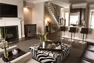
I love the wall color, and how the dark wood furniture popped off of it, but also blended with it to create sort of a milk-chocolatey goodness. And I could only dream of having that amazing kitchen opened up to our living room, with that gorgeous stair case peeking around the corner. The fresh green plants added the subtle hint of color that went perfect with this neutral room. I also loved how the fireplace wall poked out and created two niches on either side for storage and displays. We have the perfect cubby area in our own space, but with a fake fireplace. I would love to make this wall a reality in our space… one day.
Then as I was thumbing through my other pictures, I found my second favorite room inspiration photo:
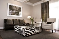
I love the gray walls with the dark wood sofa popping off of it, the huge statement piece of artwork behind the sofa (framed, like I want our mirror) and the white chairs to add contrast and lighten the space. The zebra print adds some black and white to the mix that I never thought would work in a brown/cream neutral room, until we did it in our own hou--- HOLD THE PHONE PEOPLE. Did you notice that zebra ottoman in the first picture? Look a little closer. That’s the same green plant from the first picture too. Wait, are those the same cream chairs in the bottom left corner of the first picture too? This is the same room! No wonder I loved that photo almost just as much! Maybe you saw this before I did, but man, it took ME by surprise.
I then immediately jump for joy that I have 2 photos of the same room that I adore more than any other inspirational photo I could possibly find. Then I stumble upon my fireplace inspiration picture. What did I love about it? The poked out fireplace wall creating the niches that hold the stora… stop. You’ve got to be kidding. This is yet a THIRD picture of the EXACT same room!
So I think it’s safe to say that I’ll be using this as my main inspiration to beef up our space. I’m just lucky that I have 3 views of this room that I love every square inch of to use for ideas!
I could also take notes and use these ideas in our dining room, with our dark wood table, white captain chairs, and hopefully smashing aluminum side chairs. Or, I could just buy this place.


No comments:
Post a Comment