Since we’re in Blizzard #3 this year, I spent the day bundled up inside next to my fake fireplace, under a cozy blanket, making mock-ups. I have to say, I’m glad I took a day to relax, cause relaxed I am. And so full from not delivery, but DiGiornos! Anyhow, we left off in my last post with these awesome inspirational photos:
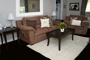
And here is what the room currently looks like:
I took the photos down around the mirror, made the floors darker, and tossed in some pillows and flowers for that punch of green. I wanted a much smaller touch of Zebra print, just enough to give it a little pizzazz. It’s hard to add pizzazz to big poofy couches, but hey, we like comfort, and I’ll sacrifice some style for seating that I spend so much time in. It looks more regal and pulled together just with the few accessories and dark floors, but it needed another touch to make it look more “finished.”
So I wanted to see what a frame looked like around that big plain mirror. It’s been in that same spot since the 1950’s, at least. I imagine it really opens up the space since it’s so narrow and long, but again, I wouldn’t know since it’s never moved! All of our pictures in this room have black frames currently, so I thought I’d try an espresso frame to polish it off, and threw one on my silhouette painting in the background:
It amazed me at how it really pulled the look together, and all it would take is a few cuts with a miter saw to some molding from a home improvement store and a little paint or stain. However, I couldn’t get that white framed picture from the inspiration photo out of my head. I had to try it on for size! I am really torn, but I think I’m leaning towards the white:
So with that, here’s the play by play again, finished off with more flowers on the final picture with the possible white frame.
So which do you like better? The white or the espresso frame? And would black frames on the rest look ok? I know I need taller lamps, the kind folks on HGTV’s Rate My Space reminded me that a couple times. This girls on a budget, but by golly I’m saving as many pennies as possible to pull this house together!


Brown frame =)
ReplyDeleteI like the white frame. Brightens it up a bit. Looks great.
ReplyDeleteKristen
Hey Samantha, I've never commented on your blog before but I somehow found it in a roundabout way and I've been having fun reading ever since! It's a tough call between the light and dark frames, but I think I like the white.. especially once it's flanked by some big white lamp shades =) By the way, LOVE the dark floors!
ReplyDeleteI love your mock ups! What a fun way to spend a snow day!It's amazing the difference a few throw pillow makes :). Oh and I like the brown frame best.
ReplyDeleteThe white frame, it balances your rug out...
ReplyDelete