Thursday, October 29, 2009

Roomboard: Follow The Yellow Brick Road.

I'm getting cheesy with titles, but I've never been good at them to begin with. Last night I was talking to another friend who wanted to redo her bedroom. She just wanted something sophisticated, but this woman has loved the Wizard of Oz as long as I've known her. So of course I had to use that as my next inspiration!

I just love this room. It's way more sophisticated than I thought Wizard of Oz could be, and actually, more than I could have ever planned out for my own space. Let's break it down!

  1. The Target wicker frames are based off of Dorothy's basket.
  2. The Walmart bedspread was a more grown up interpretation of her dress.
  3. The Target capiz chandelier table lamp comes from the sparkles in the wand. I didn't realize it until after I showed it to my friend that even the pole on the lamp matches the stem on her wand! Sometimes I even surprise myself ;)
  4. The roses "stemmed" from her shoes (that was an easy one!) and the gold square vase, the yellow brick road! I thought to put those two inspirations together since her shoes are what's connected to the yellow brick road in the movie! See now how they're even on top of each other? You can find roses, real and fake, anywhere, along with a simple block vase, so I just pulled it off Google Shopping.
  5. The bedside table I pulled from both her hair and Toto. I'm big on dark furniture because it's very modern, and mixes well with traditional pieces without sticking out as two completely different styles. I also pulled this piece from Google Shopping, but it can be easily replicated at Target.
  6. The Ikea sheepskin rug and the Urban Outfitter's headboard weren't necessarily pulled from the inspirational photos, but I wanted to make the pieces I did pull feel more luxurious and grown up. If I could put them with any of the photos, I would call her shirt, since the bedspread is her dress. But that's really going out on a limb to try and make excuses on how I came up with those two!
  7. The paint color is light and airy, and picked out from a picture of about 30 paint chips online. I have no idea what color it is, but I wish I knew now. It's nothing like my taste in colors, but it's a great color for a peaceful retreat.

My friend is on a budget, as we all should be, so I wanted to pick affordable options to update her space. Grand total for this room is about $500 with the options I chose. The headboard alone is $300, but I plan to try and whip up my own version soon. Hopefully for much less, since we're purchasing the power tools this week!

Wednesday, October 28, 2009

Roomboard: Still Seeing Green.

I received quite a bit of positive feedback on the bathroom, so I made a master bedroom to go along with the bathroom. I'm not one to make rooms flow together so intentionally, but I created a much more subdued version of the bathroom to make it feel like a relaxing master, but still had a lot of flow with the bathroom. Bonus points if they actually connect! Here's the inspiration board for the bathroom again:


Using this photo as my inspiration this time:

Here is the master bedroom, this time full on photoshop model:
All of the accessories, bedspread, wall graphic and lamps can be purchased at Target. Everything else was Google Shopping searched, but can be mimiced with more Target furniture. The mirror vanity is a huge splurge, as are the Louis Ghost chair in black and that Kelly Green headboard no matter where you find it, but so worth it, right?

Roomboard: In the Navy!

I was talking with one of my coworkers about my upcoming navy blue/mustard craft room, and she mentioned her daughter wanted to have Navy Blue bridesmaid dresses in her wedding with pink accents. I had actually used someone's navy blue wedding as inspiration for my room, so I thought why not mock up a wedding to match the room?


Now to break down the mood board:
  1. Invitation. I went with a very vintage look for this pretend wedding, and the bird and scrolls drew me in. It has almost a tattoo look to it, but it had the perfect colors to match the wedding. It will also help tie together some key details down the road.
  2. Navy blue silk bridesmaids dresses of course!
  3. Wedding Dress. I love the look of the shrug with the old 40's style hat and netting. The short cut of the dress would work best in an outdoor/casual wedding. The shrug would work nicely with a simple floor length wedding gown as well for a more formal event.
  4. The cake. I used vintage, dot patterned milk glass as inspiration. The navy blue ribbon on the cake would tie together the flower girl and ringbearer details below, and of course match the overall navy blue theme. The flowers are similar in color to the bouquets, but a different flower that would work better as a cake topper, pink and yellow roses. The metal pan it's sitting on was actually silver. I edited the color to an aged brass shade to make it more antique. The scroll on the pan pulls from the invitation.
  5. Plastic cups can look elegant next to a pretty aged brass vase with delicate pink and yellow roses on a navy blue table cloth. Frame some pictures of the bride and groom and family and friends in gold frames around this set up.
  6. Groom and Groomsmen. Navy blue suits, soft, silk ties, and orangey/yellow/pink calla lillies to match the bouquets.
  7. Bouquets. Orangey/yellow/pink/ivory calla lillies, tied with navy blue ribbon and gold charms hanging from the bows.
  8. Card holder. Bird cage! See where the bird in the invitation came from now? Both screamed vintage to me, but tie themselves together. Pretty pink ribbon on top pulls from the men's ties.
  9. Table setting. Navy blue table linens, white chairs (pretty standard at most halls) and pink and yellow flowers trailing down the middle. White ceramic accessories pop against all the colors.
  10. Ring Bearer Pillow. White satin to match the bride and flower girl dresses, with a navy blue ribbon tied across it. Hang gold rings from the ribbons.
  11. Flower Girl Dress. White satin with a navy blue sash. Pink/yellow/ivory roses to tie into the drink table decoration and cake topper. For their basket, a birds nest or white bird cage would be adorable to drop petals from.

There you have it. A picture perfect vintage inspired wedding with navy blue, pink and yellow accents! Makes you want to walk down the aisle again, right? I sure do!

Roomboard: Green with Envy.

I decided to take a stab at planning an entire room around nothing but one photograph as inspiration. Surprisingly, it was easier than I thought. So P.S., if you have a favorite photograph of a room or person, send it over for me to dissect!

I used this photo as inspiration:

Which became this:

Now I'll break down how I went from a swanky hotel to... a bathroom.

  1. The paint choices. Black, White, Kelly Green, and Black and White prints. In this room, paint the walls Kelly Green, the vanity black and the mirror frame white.
  2. The shape of the mirror pulls from the trim around those shelves that hold the bottles in the back wall.
  3. The design of the shower curtain and vanity lights pull from the chandelier.
  4. The light wood choice pulls from the liquor in the bottles.
  5. The line of ceramic accessories that would go on the light wood shelves comes from the row of white chairs at the bar.
  6. The vanity of course comes from those FABULOUS chairs in the foreground that have a white top trim and are a mostly dark color.
  7. The smaller chairs in front of the huge ones even looked like toilets, so that's what spun off into the idea for a bathroom in the first place.
  8. Glass drawer knobs mimic all the shiny glass surfaces in the picture.

All the accessories like soap dispensers, tissue holders or whatever cutesy stuff you might want could be any black and white print (houndstooth, damask, checkerboard.. they would all go with the simple shower curtain, which was the reason I picked it) or more bamboo. However, the bamboo would pop more on the vanity and give it a more earthy feel. Your choice which you would prefer depending on taste. Everything I put in my board came from Target, Home Depot, and a Google Shopping search. For all the accessories and paint combined, it came to a grand total of $375.

There you have it. It was so much fun to pick apart and give a new spin on an already fabulous room. There will definitely be more in the future. So bring on more inspirational photos!

Friday, October 23, 2009

Ikea Is Dangerous.

I spent the better part of my afternoon alone at Ikea. It's definitely not nearly as fun as it is with Drew, even though he doesn't like to smell the roses, I mean test the furniture, as much as I do. I was cruising along with nothing but 99 cent door dampers for our cabinets (which were $9.99, ridiculously overpriced for some cheap plastic!) until I spotted the most perfect pot planter I've ever seen. I immediately swooped two of them up (second one in line):


Why? It looks just like the best looking shower curtain on Earth... MINE!
And at just $3 each, how could I say no? I couldn't pass up a tin watering can as well. I plan to put the pots flanking either side of the door on our porch:
They'll pop nicely on the brick porch against the blue paint, much like all the other white does! I also found a hanging star to go in the craft room for my treehouse feel. It was so new, there was no price on it! I also got some outdoor lights that I've wanted for freaking ever, so I thought I'll just go ahead and get them now. I also got another $2 combo meal, this time for myself. I'm very content now :)

I'm in Philly!

Drew signed up for a review class for his CFP class in Philly, and I decided to trail along with him. We got in yesterday afternoon, and after google maps helped us to the wrong hotel (but with the correct address!) we finally arrived at our *correct* hotel room. We went down to the front desk and asked them where our complimentary afternoon snack was, and they decided to show their definition of professionalism by proceeding to joke with us about how basically, we aren't getting a snack. We were confused considering he got a room that had a complimentary breakfast, afternoon snack and dessert, according to the website when he booked it. We were upset, but since we couldn't get a straight answer out of the pathetic front desk staff, we went back to our room to unpack before hitting the town. Found out our room is right next to the take-off and landing pads at the airport!

We were driving down the highway looking for a place to explore, when OH MY GOD IKEA sign popped up in our view. We pulled off immediately, and got the awesome $2 combo (that feeds the both of us!) and hit the as-is section. Amazingly, they had more of our cabinet doors we're stocking up on for the kitchen remodel, but it was attached to some broken drawers. We got our other doors for $3 a piece, normally $40!! I decided not to look around anymore since he would be in class all day Friday, so I would just walk around alone later. We decided to hit Best Buy next door and broke down and purchased a GPS before heading downtown. That was the single "best buy" (har har) we made so far, as we drove around 2 hours looking for a place to park even WITH the GPS! So we parked by a bay and got some shots before searching for the best reviewed brewery closeby.


The pizza was to die for, service not so much. Since they didn't have any cidery beers, I'm not going to comment on that one!

Anyhow, I'll be writing more about this trip as the days go on, since I have nothing to do but relax in this chaise by the window watching the planes land next to my hotel window. It's now raining, the wind is blowing hard, and I'm glad I'm not dealing with the turbulence along with those plane passengers.


Monday, October 19, 2009

Apartment Therapy Fall Cure.

I'm lightly dabbling in the Apartment Therapy Fall Cure (can you tell I'm obsessed with that site?!) and thought I'd post some of my inspiration for the room I hope to "cure" before the 8 weeks are up... my craft room! Sadly, this is what it looks like currently. It was was my uncle's old bedroom, and definitely straight out of the 70's. I thought I'd work with the wood paneling, rather than against it.


Since it's an attic, and covered in wood paneling, I thought I would make it feel like a treehouse. I love outdoors at my dad's at night, peace and quiet in the country. At the moment, the idea is to leave the most sloped part of the ceiling wood paneling to mimic a tree house roof, and paint the sides a deep navy color to mimic the night sky. I initially wanted to go a lighter color, since it's been so gloomy up there. However, I've realized when done correctly, dark rooms feel cozy and have been more inspiring to me than light and bright. I need an inspiring space to craft!


I want to find some star shapes to hang from the ceiling in groups. This picture was the best I could find as an example with my chosen wall color, along with almost the exact shade of the paneling in this wood:

As an accent, I've fallen in love with mustard yellow and chartreuse. I have a white poang chair I worried would stick out too much, but looking at these mixed with the yellows/greens, I think it goes nicely and helps make the deep wall color feel less harsh:


That last picture makes me really excited about the color on the shade of my leg lamp. Yes, A Christmas Story leg lamp :)

Hopefully my vision comes together as I invision it. It's getting really cold upstairs so I won't be able to use the space all that much for the time being, but I'm hoping for some warmer days to work on the room. In the mean time, I can't wait to thrift for some accessories and hopefully husband will help put together some shelves for all my stuff! He's becoming a pro after all the deck work.

Halloween at the Wiltshire's.

I spent this evening putting together the finishing touches on our Halloween and Fall decorations, and thought I'd share some sneak peaks!

I'm so excited to finally have a mantle! I haven't had one to decorate since I lived with my mom. I just went to my trusty accessory bin and pulled out some random purple, black, clear and off white accessories. Purple, orange and black are my favorite Halloweenish colors, so I used that throughout the room.

I photoshopped the background our of this picture of our niece dressed as a pumpkin :)

I've had that star/moon candle holder for over half my life, and I thought it gave a little bit of spook. The candle holder is a wedding favor with our $1 yankee candles we got a month back. I printed off a picture of a black cat and stuck it in the jar. The purple candle is from a feng shui kit from my stepmom, and the far right hurricane glass candle holder was part of our wedding decorations.


The bat shade idea is from good old Martha Stewart. I also used some purple and black 50 cent Ikea candle holders and some fake leaves to go with my purple/black/orange theme.

Another fun decoration I've had most of my life, that big ugly rat. I have this thing for animals that are so ugly they're cute. This poor thing is one of them! I got that purple goblet a couple years ago well after halloween was over. It has glittery spiders on it! I filled it with our cork collection and set it on a coaster that goes to a saucer set we never used. I currently use the saucers as supply holders in my craft room.

My favorite all-season go-to decoration: the white platter! Drew often takes it to make dinner, but he kindly washes it off quickly for me to put back out. I got some autumn potpurri to go with the fake leaves I have spread around. The big candle holder was actually from a christmas sale about 3 years ago. When the candle is lit, the interior sparkles like crazy. And again, more of those wedding favors!


I finished these a while back, but I'm so proud of them. I've gotten to where I can whip up a pillow in about 10 minutes, zipper and all. They're so incredibly comfy since I splurged and got a fancy pillow stuffer. It was well worth the $10! Now that I made the initial investment for the pillow stuffer, I can make up a new pillow for about $5 a pop. You can't beat that with a stick.

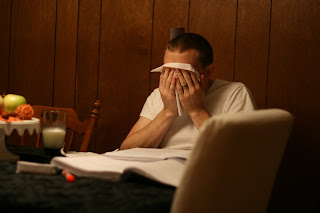
Poor Drew. While I'm in here having fun decorating and blogging, he's in the dining room sick and studying for our "vacation" this week. We're going to PA for a study session for his certification test. Rupert was hungry while we were out grocery shopping and decided to eat his homework. Really! And that orange highlighter turns up all over the house. We went to bed last night and found it under the covers.


More Martha Stewart love... our beautiful cake stand! Also our favorite: green apples! I could dedicate a whole post to our love for green apples, but I'll spare you. Just know that was the common interest we shared when we first met. It's sad.


And in my spare time I've been working on sewing my first dress with my first pattern. It's taking me a while since I'm not working on it straight, but it's coming along nicely!

Engagement Anniversary.

I know, two posts in a row about engagements. We just spent our "engagement anniversary" at the place he proposed this past weekend! We drove an hour to get to Carter Mountain, and then spent 40 minutes, uphill, in a manual transmission car, trying to get from the street to the parking lot. It was good to get out of the car!

Enjoying some scenery at the spot he proposed at a year ago :)


Awesome dad award. Radio flyer wagon and a mickey mouse shirt? Don't think he can get much cooler!
Check out Drew representing the wedding date shirt :)


This about sums up how we felt about driving an hour and 40 minutes, and they didn't have a SINGLE granny smith apple, the one apple we came to pick!
So we drove to my old work (I can't believe I drove this 60 mile commute every day!) to play with the geese and take a walk around the pond.
While my Mini waited patiently for another fun ride :)

Sunday, October 18, 2009

Engagement Chicken.

In honor of our 6 month wedding anniversary, I present to you the story of the Engagement Chicken: http://www.glamour.com/magazine/2006/07/engagement-chicken

I read an article last year in Glamour about a chicken that claimed an engagement is in your future after making this feast. I convinced Drew to whip it up for us on September 25 of last year, since I really shouldn't be trusted in the kitchen. Especially not with something this involved! However, I let him know the name of it, and the back story (pretty much blowing the whole point, right?). He tried to convince me that it was dumb, and the poor chicken turned out awful. Oh well, it was all in good fun.

As it turns out, he had already purchased my ring on September 18th! So although the chicken didn't convince him to buy the ring (heck, I couldn't even make the meal) an engagement did occur just 2 weeks later! And I had no. freaking. idea.
I would like to thank my little cooked friend for boosting the process though, even just in theory! So if you want to try your luck and hitch your man... sacrifice a baby chicken! Fair warning, shoving that lemon in it's hiney is extremely awkward, but sure to give a few laughs. Which may just bring you close enough together there's no way he WOULDN'T want to marry you!

Thursday, October 8, 2009

Meshing Design Styles.

Until I entered the Apartment Therapy "Room for Color" contest, I never paid much attention to my design style. I always thought I just have a thing for mixing pretty traditional pieces with modern. But one comment on my entry page really stuck out at me. Whether it's true or not, I think they hit the nail on the head:


"What a charming bathroom! It's so hard to know what to do with a little bathroom and yours is wonderful! Great job blending a masculine and feminine look! I just love it.I wish AT would feature more small but beautiful bathrooms!

posted by heatherdazy on October 6th 2009 at 2:23pm"

I thought it was a lovely compliment, but I reread that bolded sentence a few times thinking "really? DID I mix masculine and feminine in this space?" So I stopped and thought about the room, and it made sense. I used a pretty feminine shower curtain and a dark, clean lined vanity with stainless steel feet. I used a traditional, rounded pattern tub and a clean, simple, no frame mirror. There's quite a mix of clean lines and traditional styles, but those two things can also be classified as masculine and feminine. I'm no design expert, but I decided to compare apples to oranges in the rest of the house.

Our living room in this picture is pretty basic. This doesn't show any of the recent accessory additions, but it shows the bones. I took a color from the Ralph Lauren Urban Loft series called "Stone" because it was a little cooler than a beige neutral and a little more modern. But I combined it with some ornate damask drapes to soften the stark color. For the tables, I wanted those sexy curvy legs, which reminded me of traditional Beauty and the Beast furniture, but I got them in a deep espresso color with clean lines on top. For the rug I wanted a soft color to break up all the dark furniture, but got one that had a square pattern all over it. For the sofas we got reclining for him and a warm camel color for me. The lamps are really feminine, and fairly popular, acrylic ball bases, but I used plain jet black frames. But when I stop and think about it, I pretty much nailed a mix of feminine and masculine:


For the master bedroom, the bed and dresser were purchased within 2 months of us dating. They're Ikea Malm in Black Brown. Very sharp lines, very masculine color. But we used soft blue/green sheets and a branch/bird theme comforter. The walls are (of all brands) Martha Stewart blue but I hung a grungy, vintage horse picture. I hung flowy sheer and linen curtains next to the real camplight lamp. There's A LOT more to add to finish off this room, but so far, another mix of masculine and feminine:


The office has since been turned into an "Xbox Command Center" but when it functioned as an office we mixed an aubergine paint with a very generic, simple lined desk. A leather office chair with some Ikea flower pictures. The curtains are a mix themselves: sheer and flowy with a very modern, clean lined box pattern:


So although pretty much everything in this house is simply a mix of my own love for modern and traditional, it shows as a mix of masculine and feminine. A way of meshing his style with mine.

Whenever a friend decides to change the look of something, and mention what they like and what their significant other likes, my mind starts racing on how to effectively piece their likes together and make it work. Although I may never tell them what, in my mind GENIUS, idea I come up with, I think maybe I just have a thing for mixing styles.

If you or someone you know needs help, I would love some more free-time brainstorming to do ;)